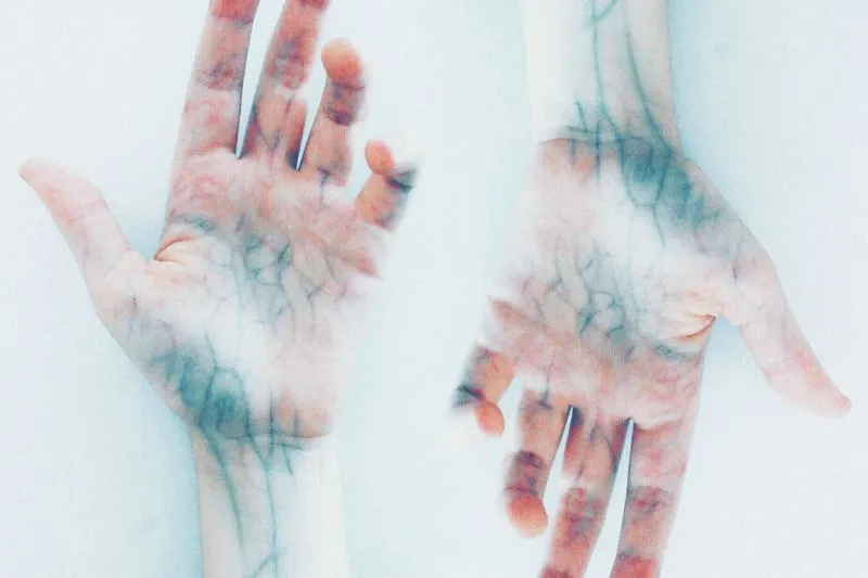
No, your veins aren't blue. The blood inside them is dark red, and the blue you think you see on the inside of your wrist is an optical effect. In 1996, seven researchers took the question apart in a study published in the journal Applied Optics. The apparent colour of a vein, they found, depends on how skin scatters and absorbs light, on how oxygenated the blood is, on the diameter and depth of the vessel — and on how our eyes perceive it all. Four factors. Not one of them is called "undertone".
And yet it's THE test everyone passes around to work out whether their skin is "warm" or "cool". Green veins, you're warm; blue veins, you're cool. I've done it dozens of times (and recommended it more than once — guilty as charged). Last Sunday at 10.40am (coffee still hot), I finally ran the experiment properly: same wrist, three lights. At the living-room window of my Hackney flat, blue-violet veins. Under the bedside lamp, a frank olive green. Under the kitchen spotlight, an indescribable grey — the colour of a biro that's leaked in a coat pocket. Three lights, three verdicts. One skin.
That's the whole problem with DIY colour analysis as it circulates online: the most shared tests read the lighting in your room at least as much as your skin. The result? You're a "Soft Summer" one evening under the ceiling light and a "Deep Autumn" the following Saturday, with a wardrobe that never asked for any of this. If you've seen those videos where someone finds their "season" in three seconds of filter, you know exactly what I mean.
So here's the method I use — three steps, with fabrics you already own. Undertone (warm or cool), contrast (between your hair, skin and eyes) and intensity (bright or soft), all tested in daylight. A palette isn't a prison.
Undertone, value, intensity: what is colour analysis actually about?
Personal colour analysis looks for the colours that sit well with your natural colouring — skin, hair, eyes — when you wear them near your face. It doesn't measure anything in the scientific sense. It compares, by eye, what a colour does to your complexion. To compare properly, you need to know what you're looking at.
Where your skin colour comes from
Skin colour is shaped first by melanin. According to Wikipedia's article on human skin colour, melanin is the main determinant of skin colour in people with darker skin. In lighter skin, colour comes mainly from the bluish-white connective tissue under the dermis and from the haemoglobin circulating in the veins of the dermis — which is why a flushed face turns visibly pink. Melanin itself comes in two forms: eumelanin, more abundant in darker skin, and pheomelanin, which has a pink to red hue.
"Undertone", on the other hand, isn't a medical term. It's make-up-artist and image-consultant vocabulary. It describes the background cast of your skin: golden, peachy or olive (called "warm"), pinkish or bluish ("cool"), or a mix of both ("neutral"). It has nothing to do with how light or deep your skin is. Very fair skin can be warm, very deep skin can be cool — which is why "fair skin = silver, olive skin = gold" means nothing at all.
The three dimensions of a colour
The more refined methods, such as Colour Me Beautiful's Tonal system, build on a system published in 1905 by the American painter and art teacher Albert Munsell (who had visited Chevreul's tapestry works in Paris). Three dimensions: hue (where the colour sits in the rainbow), value (light to dark) and chroma (soft to bright). Translated into wardrobe language, that gives you three questions.
- Warm or cool? Does the hue lean yellow (coral, mustard, camel) or blue (fuchsia, royal blue, slate grey)?
- Light or dark? And above all: how big is the gap in value between your hair, skin and eyes?
- Bright or soft? A pure, saturated colour, or a "dusty" one, as if it had been mixed with grey?
Keep those three questions in your head. Those three questions are what will help you in a changing room.
Veins, gold or silver, pure white: what are the viral tests worth?
The three express colour tests give you clues, never a verdict. The most famous one is also the flimsiest.
The vein test
If the apparent colour of a vein depends on its depth, its diameter and the way skin scatters light, it can't settle anything on its own. What you see on your wrist is a mix of three things: your skin, the optical effect of the vein and the light in the room. The test can land on the right answer — when it agrees with the other clues. Alone, it's not worth much.
The gold or silver test
Hold a gold piece, then a silver one, against your cheek and see which one "switches off" your face. It tells you more than your veins, because it compares two colours worn against skin — exactly what you'll do next with fabric. It has its traps. Rose gold, very yellow gold and tarnished silver don't tell the same story. I've gone through this face-off in my guide to choosing, matching and wearing jewellery, which you'll want again once you've found your palette.
The pure white vs off-white test
A brilliant-white T-shirt, then a cream jumper, under your chin. If pure white makes your skin look clear and cream turns you yellow, that's a cool clue. If pure white greys you out and cream warms you up, that's a warm clue. It's my favourite quick test — two garments almost everyone owns (and not a single piece of jewellery required).
Why a colour changes your face: Chevreul's law
A colour worn near your face changes the way your skin is perceived — and a French chemist laid the groundwork for that idea in the nineteenth century. Michel Eugène Chevreul ran the Gobelins tapestry works in Paris, where, as Wikipedia's article on Chevreul explains, he investigated complaints about the dyes. His finding is a lovely one. The much-criticised black dye was first-rate. Yet fabrics dyed with it looked weak and reddish when surrounded by deep blues or purples.
Chevreul called this simultaneous contrast: a colour tends to appear to shift towards the complementary of its neighbour, in both hue and darkness. He published his research in 1839, and it was translated into English in 1854 as The Principles of Harmony and Contrast of Colours. His work on colour harmony is also, according to Wikipedia's history of the subject, one of the principles underlying personal colour analysis.
Now take that to the mirror. A piece of fabric under your chin becomes the "background" of your face — depending on its hue, it brings out redness and shadows, or it evens everything out. That's precisely what you'll be watching for during the test. A perception effect described almost two centuries ago, by a man who simply wanted to know why a perfectly good black looked wrong next to blue.

Setting up your home test: daylight, bare face, hair covered
A home colour test needs three things: the right light, a make-up-free face and neutralised hair. Get the first one wrong — the other two stop mattering.
The light: by a window, never under a bulb
A light bulb doesn't shine "white". The Energy Saving Trust's lighting advice points out that bulbs come in warm white or cool white tones, and that a bulb's colour rendering index (CRI) shows how accurately it renders colours. A CRI of 80 or more is fine for most household tasks. Deciding which colours flatter your face isn't one of them.
Daylight isn't neutral either. The standard reference for daylight is a colour temperature of around 6,500 K; early morning and late afternoon light — the "golden hours" — is warmer, while overcast skies, shade and window light run bluish. Daylight is still the best reference, because it's the light people see you in most. My rule — late morning or early afternoon, facing a window, no direct sun on your face. No testing at 7.30pm in April, when the sun is already low.
Your face: cleansed, moisturised, done
Foundation, blusher, even tinted moisturiser — they all skew the result, because you'd be judging how a fabric works with your make-up. Cleanse, let a moisturiser sink in — that's it. If you've got fake tan on or a touch of sunburn, wait until it's gone (your skin isn't in its usual state, and its usual state is what you're dressing).
Your hair: cover it if it's coloured
Hair dye changes the equation: the colour on your head isn't the one your skin grew up with. I'm a bleached blonde — my roots and my lengths tell two different stories (and neither is the whole truth), so I wrap them in a pale grey towel for step 1. If your colour is natural, leave it on show.
What you need
- A mirror big enough to show your shoulders, facing the window.
- A light grey or off-white top, or a neutral towel round your shoulders.
- A dozen plain fabrics: scarves, T-shirts, pillowcases, towels, fabric offcuts.
- Your phone, to photograph every try in exactly the same spot.
- Ideally, someone you trust to look with you (an honest one).
Step 1: warm or cool, the fabric face-off
Step one settles warm versus cool, in head-to-heads. Two fabrics close in lightness and intensity — one leaning yellow, the other leaning blue. Hold one under your chin, look for five seconds, swap.
The six face-offs
| Family | Warm side | Cool side |
|---|---|---|
| Red | brick red, coral | raspberry, cherry red |
| Pink | peach, salmon | fuchsia, icy pink |
| Green | olive, khaki | emerald, bottle green |
| Blue | petrol blue | royal blue, cobalt |
| Dark neutral | chocolate, camel | charcoal, slate grey |
| White | cream, ivory | brilliant white |
You don't need every exact shade. What matters is that the two fabrics in a face-off are close in lightness and differ mainly in temperature. A pale pink against a hot fuchsia tests nothing (except your patience).
What to look at, and what to ignore
Look at your skin. Signs of a good match: your complexion looks even, shadows and redness fade, the whites of your eyes look clearer, your features stand out without you looking made up. Signs of a bad one: skin that turns grey or sallow, shadows deepening around the nose and mouth, a garment that walks into the room before you do.
Ignore what you love. Your favourite colour isn't necessarily your best colour — mine is mustard, and it gives me the complexion of the morning after a wedding. Then count the points. If the warm fabrics win four face-offs out of six, your undertone is warm. A draw? You're probably neutral, and you can borrow from both sides, favouring colours that are neither too yellow nor too blue (sage green, dusty pink, denim blue).

Step 2: the contrast between your hair, skin and eyes
Contrast is the gap in lightness between your hair, skin and eyes. It tells you whether you suit bold combinations — or tone-on-tone. It's the step the quick tests forget, and the one that explains why two "cool" people don't dress the same way.
The black-and-white photo test
Take a selfie in daylight, bare-faced, hair visible (its current colour, if you're keeping it), then switch it to black and white. Without colour, only value is left. Three possibilities.
- High contrast. The gap in greys is obvious: very dark hair with fair skin, or deep skin with very light eyes. You carry black and white, navy with white, sharp combinations.
- Medium contrast. Distinct greys, but close together. Two shades one step apart (navy and sky blue, chocolate and beige) suit you better than pure black and white.
- Low contrast. Hair, skin and eyes melt into neighbouring greys. Tonal dressing flatters you; pure black and white takes over.
My case, bleach and all: medium contrast. Pure black and white turns me into a photo-booth passport picture. Navy with pale grey, though, works without even trying.

Step 3: bright or soft, the intensity that suits you
Intensity — Munsell's chroma — sets pure, saturated colours against colours softened with grey. Same method as step 1, except that this time both fabrics in a face-off share the same temperature. One bright, one soft.
- If you're cool: fuchsia against dusty rose, royal blue against blue-grey, emerald against grey-green.
- If you're warm: bright orange against soft apricot, apple green against olive, golden yellow against ochre.
A colour that's too bright wears you — people see the garment before your face. A colour that's too soft erases you — your skin looks dull, tired, washed out. The right intensity is the one where people notice your eyes first. In my case, soft won all three face-offs, dusty rose over fuchsia first. And the grey-green looks suspiciously like the sage I painted my living room in March (which says a lot about my taste).
From palette to wardrobe: what to do with your results
Your three answers — warm or cool, high or low contrast, bright or soft — make up your palette. That means a few base neutrals, a handful of colours to wear near your face, and some accent colours. Here's how I translate it into a wardrobe.
Neutrals first
Warm side: camel, chocolate, cream, olive, a navy that leans towards petrol. Cool side: grey, charcoal, navy, brilliant white, rosy taupe. These neutrals carry everything else, and it's where colour analysis pays off most when you're building a capsule wardrobe of a few pieces that all work together. A coat, a pair of trousers and a knit in your neutrals — and half the job is done.
Near your face, away from your face
The rule that has served me best: palette colours near your face (tops, collars, scarves, earrings), everything else lower down. Love a mustard jumper but you're cool (welcome to the club)? Wear it over a brilliant-white shirt with the collar showing, or with a cool-toned scarf — the colour touching your face will be the right one. Same logic for lipstick, which recolours the lower half of your face in one move.
Colour analysis and body shape answer different questions
Colour analysis picks colours; body shape picks cuts. The two work together (a bright colour draws the eye wherever you put it), but neither replaces the other. For the other half of the subject, my guide to dressing for your body type goes through the silhouettes one by one.

Where the four-season method falls short
The seasonal method files everyone under Spring, Summer, Autumn or Winter. It's handy for remembering a palette. But it grew out of a classification by artists and consultants, not out of measurement — and its own heirs ended up finding it too narrow.
A painter's idea turned mass-market method
In 1928, the Swiss-born painter Johannes Itten, who had taught at the Bauhaus, noticed during a class on colour harmony that his students were choosing colours that showed themselves "as they are". He turned that into the idea of "subjective colour", developed in a 1961 book on the art of colour. In 1980, the American designer Suzanne Caygill published a book that already split each season into sub-groups, with names like "Early Spring" and "Metallic Autumn". The same year, Carole Jackson published her seasonal guide — the book behind the Colour Me Beautiful name — and personal colour analysis peaked in popularity in the early 1980s.
A delicious detail: Jackson herself wrote that she could have called the colouring types "Type A" or "Type B", and that the seasons were simply a more poetic way to describe them. From day one, then, a season was a handy label.
What the seasons miss
Three limits — pointed out by professionals themselves.
- Four boxes aren't many. Colour Me Beautiful (a British image consultancy) traces its story back to Carole Jackson's first book. On its About us page, it admits that under the seasonal system some colours in a client's palette wouldn't work on them, and that "the seasonal approach just doesn’t work for everyone, particularly the southern hemisphere". Its conclusion: "Recognising the limitations of the seasons, the Tonal system was developed." That system, based on Munsell, starts from one dominant characteristic plus one or two secondary ones.
- Hair counts. The pioneers held that skin alone decided your season — "Remember, do not rely on hair coloring to find your Season!", Bernice Kentner warned in 1978, as quoted in Wikipedia's article on colour analysis — and that it stayed the same for life, tan included. Colour Me Beautiful takes the opposite view on hair: "It’s totally ignored in the seasonal system." Between greying roots, bleach and an August tan, your colouring moves more than the theory admits.
- A season's name doesn't say it all. Two "Winters" can be one very high-contrast, the other far less so. That's why methods have kept adding sub-seasons ever since Suzanne Caygill: finer, at the cost of even narrower boxes.
My take: keep the seasons as a shorthand. "Soft Summer" is a poetic way of saying "cool, low contrast, soft intensity" — and it's the second version that will help you in front of a rail.
Trend colours and your personal palette: not the same thing
Seasonal trend colours are the ones catwalks and brands push for a few months. Your personal palette doesn't change with the collections. Pantone, for instance, named Mocha Mousse (17-1230) — a mocha brown — its colour of the year for 2025. That doesn't mean you have to wear it. Or that you can't.
If you're warm, that brown is probably already among your neutrals. If you're cool, wear it away from your face (bag, shoes, trousers) or swap it for a cooler taupe. The question to ask about a trend isn't "is it my season?" but "where can I wear it?". It's the same logic as my piece on adapting runway trends to everyday life: keep the idea, adjust the version. To work the season's colours in without buying everything again, my guide to working the season's colours into your wardrobe goes through the combinations and the pitfalls.
Is a paid colour analysis session worth it?
A session with an image consultant isn't essential, but it has two advantages over the home test: a trained outside eye, and far more fabrics. In South Korea, personal colour analysis has become a tourist attraction. A Bloomberg report published by TIME in July 2023 described sessions of around an hour — consultants drape hundreds of fabric swatches across clients' shoulders. The price: $80 to $160 in most Korean studios, against $545 for a three-hour session at House of Colour in Brooklyn. The topic had racked up 375 million views on TikTok.
Closer to home, the British firm House of Colour has offered colour analysis since the mid-1980s, and it states that its analysis is never done online — a good sign of a serious approach. Whoever you book, ask three questions first. Is the session done in daylight? Bare-faced? With how many fabrics?
My take: start with the home test. Next Saturday, late morning, a window, a dozen fabrics, an honest friend. If your face-offs are clear-cut, you've got your answer for free. If they stay blurry, you'll know exactly what to ask a professional — and you'll spot straight away the one who sits you under a strip light.
Frequently asked questions
Is the green-or-blue vein test reliable?
Not on its own. According to a study published in Applied Optics in 1996, the apparent colour of a vein depends on four factors — how skin scatters and absorbs light, blood oxygenation, the diameter and depth of the vessel, and perception. The lighting in the room changes the result too. Treat it as one clue among several, to be confirmed with the jewellery, white and fabric tests.
What time of day should I do a home colour test?
Late morning or early afternoon, facing a window, with no direct sun on your face. Daylight shifts in colour temperature: it's warmer around sunrise and sunset, and bluer on overcast days and in the shade. Always avoid light bulbs, whose tones vary from warm white to cool white.
Do I need to take my make-up off?
Yes. Foundation, blusher and tinted moisturiser change the skin colour you're looking at, so you'd be judging how a fabric works with your make-up rather than your complexion. A plain moisturiser is fine.
I can't choose between warm and cool: am I neutral?
Probably, if your warm-versus-cool face-offs end in a draw. Neutral skin suits in-between colours — neither too yellow nor too blue: sage green, dusty pink, denim blue, taupe. Then move on to the contrast and intensity steps, which will narrow things down.
Does black suit everyone?
No. Pure black mostly flatters high-contrast colouring (very dark hair with fair skin, for example). If your contrast is medium or low, navy, charcoal or chocolate do the same job — without hardening your features. And black works perfectly well away from your face.
Does my palette change with age or a tan?
The pioneers of the seasonal method claimed your season stayed the same for life, tan included. In practice, your hair colour and the depth of your complexion change, and they alter your contrast. Redo the contrast step when you change hair colour, after the summer or as your hair turns grey.
Can I get my colours analysed online, from a photo?
With caution. A phone automatically adjusts the white balance of each photo to the lighting, which changes how your skin looks on screen. Some firms (House of Colour, for one) refuse to do the analysis online at all. A photo is mainly useful for comparing two tries taken in the same spot, in the same light, with the white balance locked.
Sources
- Kienle A. et al., "Why do veins appear blue? A new look at an old question", Applied Optics, vol. 35, no. 7, 1996
- Wikipedia — Human skin colour
- Wikipedia — Michel Eugène Chevreul
- Energy Saving Trust — Lighting
- Wikipedia — Colour temperature
- Wikipedia — Colour balance (white balance)
- Wikipedia — Colour analysis
- Colour Me Beautiful — About us
- TIME / Bloomberg — 'Personal Color Analysis' Craze Fuels Tourism Boom for Seoul (July 2023)
- House of Colour — Colour analysis
- House of Colour — About us
- Pantone — Colour of the Year 2025, Mocha Mousse