Three years ago I bought a tin of paint called "Abyss Blue" from B&Q. The name was gorgeous, the swatch on the chart looked stunning, and I was convinced it would be fabulous in my bedroom. The result: a wall that resembled the inside of a municipal aquarium. Not the Majorelle Blue of Marrakech I'd imagined — more the blue of a 1990s school gym.
My mistake? I hadn't the slightest notion of colour harmony. I was looking at ONE colour instead of thinking in palettes. Since then, I've spent an unreasonable amount of time understanding how colours work together — not the abstract theory from GCSE art, but the practical version that tells you "this blue goes with that beige, that brass lamp and the oak floor you've already got." Here's everything I've learnt.
The colour wheel: your secret weapon

The colour wheel is the compass of colour. It arranges the 12 base colours in a circle, and once you understand its logic, you'll never make a matching mistake again. It's a tool invented by Isaac Newton in 1666 — and it's still the foundation of everything designers, painters and decorators do 360 years later.
The 3 colour categories
- Primary colours: red, blue, yellow — they can't be created by mixing other colours
- Secondary colours: orange (red + yellow), green (blue + yellow), violet (blue + red) — each is a mix of two primaries
- Tertiary colours: the 6 intermediaries — blue-green, yellow-green, yellow-orange, red-orange, red-violet, blue-violet
Hue, saturation, lightness
Every colour has three dimensions, and this is where it gets interesting for interiors:
- Hue: the colour itself (blue, red, green…)
- Saturation: the colour's intensity. A highly saturated blue is vivid, almost "loud." A desaturated blue is soft, nearly grey. In interiors, fully saturated colours are rarely used — they assault the eye
- Lightness: the amount of white or black in the colour. A light blue (blue + white) is bright; a midnight blue (blue + black) is dark
Kristina's tip: The colours that work best in interiors are generally desaturated AND slightly darkened or lightened. That's why "sage green" works better than "apple green" as a wall colour — same hue, different saturation and lightness. When in doubt, always choose the more muted version of a colour.
The 5 types of harmony that work
There are five proven ways to combine colours. Each produces a different effect, and each has its place in interior design. Let's walk through them with concrete examples.
1. Monochromatic harmony
A single hue, varied from light to dark. For example: off-white + beige + caramel + chocolate. Or: ice blue + sky blue + teal + navy.
The effect: soothing, sophisticated, elegant. It's the simplest harmony to pull off — you can barely go wrong since every shade comes from the same family.
The trap: it can become monotonous. To avoid this, play with textures — a navy velvet, a sky-blue linen and a teal cotton bring relief even when the colours are close.
2. Complementary harmony
Two colours diametrically opposite on the wheel. The classics: blue and orange, red and green, yellow and violet.
The effect: dynamic, vibrant, full of energy. Complementaries "boost" each other — blue looks bluer next to orange.
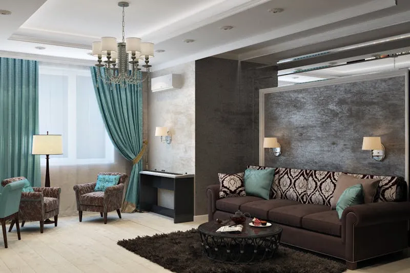
The trap: if both colours are at full saturation, the effect is violent. The solution: desaturate at least one. A teal wall with copper cushions (desaturated orange) is gorgeous. A Klein-blue wall with neon-orange cushions is a visual assault.
Watch out: Red and green as complementaries look gorgeous in theory but are dangerous in practice. Get the proportions wrong and you've got Christmas decorations all year round. Prefer muted versions: terracotta + olive, or brick + forest green.
3. Analogous harmony
Three colours sitting next to each other on the wheel. For example: yellow + yellow-orange + orange. Or: blue + blue-green + green.
The effect: natural, coherent, harmonious. It's what you find in nature — a sunset (yellow-orange-red), a forest floor (green-dark green-brown), the ocean (blue-green-turquoise). Our eyes are wired to find these combinations beautiful.
The trap: like monochromatic, it can lack punch. Add a neutral accent (black, off-white, brass) to punctuate the scheme.
4. Triadic harmony
Three colours equally spaced on the wheel — they form a triangle. The classics: red + yellow + blue (primaries) or orange + green + violet (secondaries).
The effect: lively, joyful, bold. It's the harmony of maximalism and interiors that dare.
The trap: it's the hardest to master. The 60-30-10 rule (coming next) is absolutely essential here — without it, you get a circus.
5. Split-complementary harmony
Instead of the exact opposite colour, take the two colours either side of the opposite. For example: blue + yellow-orange + red-orange (instead of blue + orange).
The effect: the dynamism of complementaries but with more nuance and less tension. It's my favourite harmony — it brings energy without the visual "slap."
The 60-30-10 rule: the magic ratio
This is THE golden rule every interior decorator uses, and it's disarmingly simple:
- 60% of the room in your dominant colour — walls, floor, large furniture
- 30% in your secondary colour — curtains, rugs, occasional furniture, headboard
- 10% in your accent colour — cushions, vases, frames, candles, small objects
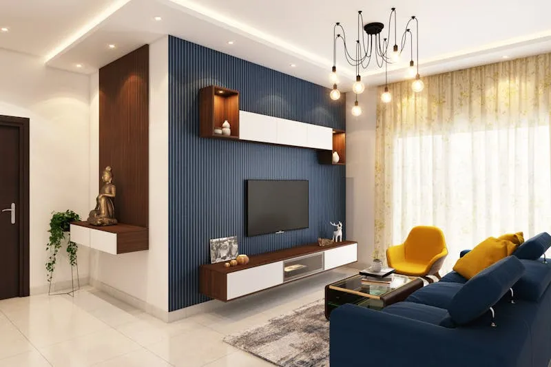
Concrete example: a living room with off-white walls and beige sofa (60%), sage-green curtains and rug (30%), terracotta cushions and vase (10%). It's readable, balanced, and works every time.
The dominant colour is almost always a neutral or very light shade. It's the backdrop. The secondary brings character. The accent brings the "pop" — that small detail that draws the eye and makes people say "oh, that's lovely."
Kristina's tip: The 60-30-10 doesn't need to be mathematically exact. It's a visual guide, not a chemistry formula. 55-35-10 or 65-25-10 works too. The point is that one colour clearly dominates, another supports it and a third punctuates.
Warm vs cool: colour temperature
Every colour has a "temperature" — it leans warm (red, orange, yellow) or cool (blue, green, violet). This distinction matters far more than people think, because it directly influences the mood of a room.
Warm colours
Red, orange, yellow, and all their variations (terracotta, ochre, caramel, peach, coral). They visually "advance" — warm walls feel closer, the room more embracing. They create a sense of comfort, intimacy, warmth (literally — we perceive a warm-toned room as physically warmer).
Where to use them: living areas (sitting room, dining room), north-facing rooms (they compensate for the lack of warm light), bedrooms (cocooning effect).
Cool colours
Blue, green, violet, and their variations (sky blue, seafoam, lavender, blue-grey). They visually "recede" — cool walls feel further away, the room more spacious. They create a sense of calm, freshness, openness.
Where to use them: bedrooms (calming effect), home offices (focus), small rooms (they enlarge), south-facing rooms (they temper the warm light).
Watch out: Don't mix fully saturated warm and cool colours in the same room — the eye doesn't know where to settle. If you're pairing teal (cool) with terracotta (warm), desaturate one of them. And use warm neutrals (wood, brass) to bridge the gap.
Neutrals: the invisible glue
White, grey, beige, black, taupe — neutrals are the "connectors" that bind colours together. Without neutrals, even perfect colour-wheel harmonies can feel overpowering. Neutrals provide "visual silence" between colours — and it's that silence that lets each colour breathe.
Neutrals have temperature too. Beige, cream and warm taupe are warm neutrals. Grey, pure white and cool taupe are cool neutrals. Choose neutrals in the same temperature family as your dominant palette.
10 ready-made palettes
Theory is lovely. But I know plenty of you just want combinations that work, ready to copy. Here are ten palettes I've tested, seen in the flesh, and recommend without hesitation.
Warm palettes
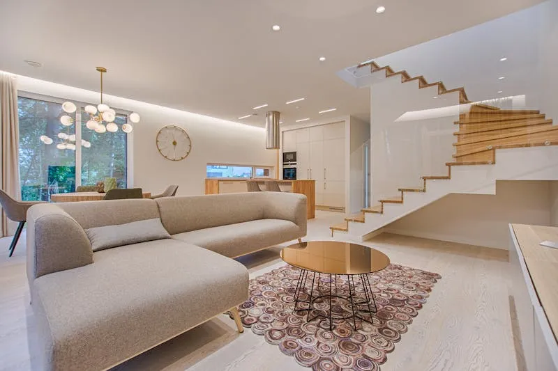
1. Enriched Scandi: off-white + light oak + sage green + brass. The Scandinavian classic warmed up by brass — it will never date.
2. Soft Mediterranean: cream + terracotta + olive + washed blue. Evokes Provence, Tuscany, summer mornings. Works in any south-facing room.
3. Autumn cocoon: warm taupe + caramel + rust + ivory. Warm without being dark — the perfect palette for a cosy sitting room.
4. Boho chic: sand + coral + mustard + indigo. Vibrant yet harmonious, with sand calming the stronger shades.
5. Modern boudoir: blush pink + burgundy + charcoal + gold. Feminine and sophisticated — sublime in a bedroom.
Cool palettes
6. Seaside: white + sky blue + sand + driftwood. The eternal classic — because it's worked since forever.
7. Enchanted forest: forest green + midnight blue + walnut brown + cream. Deep and embracing — gorgeous in a study or library.
8. Modern Nordic: pale grey + petrol blue + mustard + white. The mustard accent adds the warmth that grey-blue lacks.
9. Zen: pure white + black + light wood + one single green touch (a plant). Absolute simplicity — when less is truly more.
10. Bold contemporary: Klein blue + cream + terracotta + black. Strong and memorable — for people who commit.
Kristina's tip: Once you've chosen your palette, create a physical moodboard. Stick onto card: a paint swatch, a fabric scrap, a photo of your floor, a picture of the sofa you're eyeing. If the whole collage pleases you side by side, it'll work in the room. If one element jars, you'll spot it instantly — and swapping a swatch is cheaper than swapping a sofa.
The 7 most common colour mistakes
I've made most of these mistakes myself — and I see them everywhere. If you recognise one, don't feel guilty: just fix it.
- Choosing colour under shop fluorescents: the strip lighting in B&Q's paint aisle bears no resemblance to your sitting-room light. Always take the swatch home and observe it at different times of day
- Ignoring the undertone: a grey can lean blue, green or mauve. A beige can lean yellow or pink. These undertones determine whether your colours harmonise or clash
- Too many strong colours at once: three vivid colours in one room is too many. Two maximum — and even then, one dominant, one accent
- Forgetting the floor: your floorboards are a colour. Your tiles are a colour. Your rugs are a colour. They count in the 60-30-10 equation and they're systematically overlooked
- Ignoring adjacent rooms: if your living room is teal and you paint the corridor olive green, the transition will be jarring. Open-plan or adjoining spaces must share at least one common neutral
- Painting all four walls: in a strong colour, a single accent wall is more impactful (and easier to fix) than four walls in the same shade
- Blindly following trends: sage green is everywhere? Grand — but if you don't actually like green, don't put it in your home. You'll look at it every day for years — choose a colour that makes YOU feel good
Watch out: The costliest mistake is painting an entire wall (or worse, an entire room) without testing first. A tester pot costs £3-£8. Repainting a whole room because you hate the colour costs £80-£250. Do the maths.
Choosing by room: living room, bedroom, kitchen, bathroom
The living room
It's the most versatile room — you entertain, relax and live in it. Favour a warm neutral base (beige, cream, pale taupe) and bring colour through furniture and accessories. The living room is where 60-30-10 works best, because it naturally contains many different elements (sofa, rug, curtains, cushions, frames).
The bedroom
The priority: calm. Colours that promote sleep are soft blues (blue-grey, sky blue, blue-lavender), muted greens (sage, light olive, soft mint) and warm neutrals (cream, linen, sand). Avoid vivid, stimulating colours — red, orange, bright yellow — except as tiny accent touches.
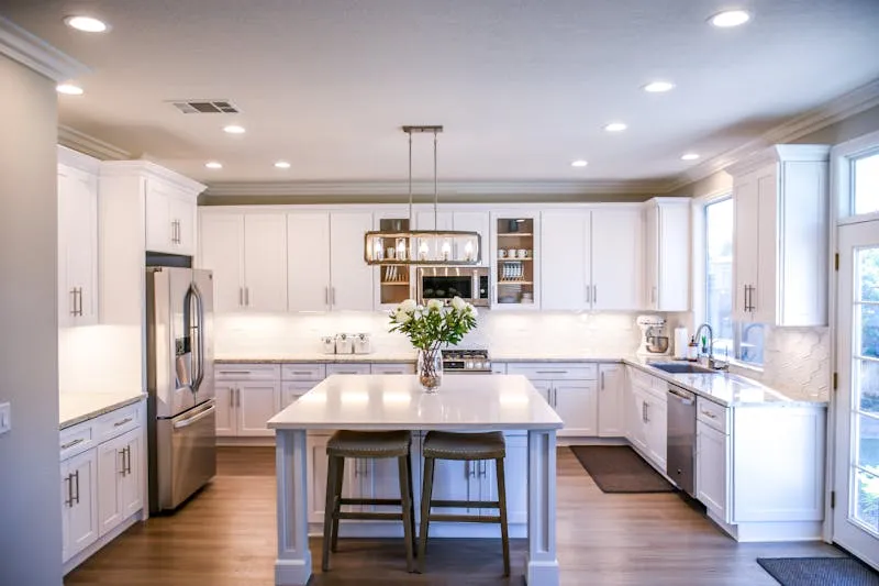
The kitchen
It's the most "functional" room, but it can also be the most expressive. Colours that work: greens (from sage to forest), blues (from blue-grey to navy), warm whites (cream, vanilla). Yellow, often associated with kitchens, is actually risky as a wall colour — it yellows with age and can look "fast food."
The bathroom
Small room, big impact. Bathrooms handle bold colour well — because you're only in there for a few minutes at a time. A dark-green wall, teal tiles, a blush-pink ceiling — these are bold choices that work because the exposure is short. And if you tire of it, it's the quickest room to repaint.
How to test before committing
Theory is lovely, but between the colour chart and the finished wall there's an abyss. Here's the method I use systematically and recommend to everyone.
Step 1 — The digital moodboard
Before touching a paint tin, create a Pinterest board or a photo folder with interiors you love. After 20-30 images, a pattern emerges: you're drawn to the same colours, the same moods. That's not coincidence — it's your taste. Trust it.
Step 2 — Paper swatches
Visit a store (B&Q, Homebase, a Farrow & Ball stockist) and bring home swatch strips. Tape them to the wall. Observe them in the morning, afternoon and evening — light changes everything. A colour can look stunning at midday and dreary at 9pm.
Step 3 — Tester pots
When you've narrowed it to 2-3 options, buy tester pots (50 ml to 500 ml depending on the brand). Paint a 50 x 50 cm square on the wall — not in a dark corner but in the most visible spot. Live with it for at least three days before deciding. Three days is the time your eye needs to adjust and see the colour "for real."
Step 4 — The furniture test
Before painting the whole wall, place your existing furniture against the test square. Does the sofa work with this colour? The rug? The curtains? Wall colour doesn't exist in isolation — it must function with everything you already own.
Kristina's tip: If you're genuinely terrified of getting it wrong, start with the loo. It's the smallest room, the cheapest to paint, and the easiest to redo. Try your bold colour there — if it works, you'll have the confidence to tackle the living room.
Frequently asked questions about colour in interiors
How many colours maximum in one room?
The classic rule says three (60-30-10). In reality you can go to five once you count neutrals and wood — which is normal in any interior. The point isn't the number but the balance: one light dominant, one assertive secondary, one or two accents, and neutrals binding the lot together.
Is white a "colour" in interior design?
Yes, and it's one of the most complex. Hundreds of whites exist — warm white (cream, ivory, linen), cool white (blue-white, grey-white) and pure brilliant white (which is almost never the right choice for walls, as it creates a clinical look). Choosing the "right white" is often harder than choosing a colour.
Can you mix warm and cool tones?
Yes, but carefully. The key is choosing a dominant camp (warm OR cool) and using the other as an accent. A sitting room dominated by warm tones (beige, terracotta) with a cool accent (blue cushion) works beautifully. So does the reverse. What doesn't work: a 50/50 warm-cool split — the eye can't settle.
How do couples agree on colour?
Start with colours you BOTH like, even if they're different. Each create a Pinterest board of 10 images, then compare. Typically, you'll find common ground — a neutral, a material, a mood. Build from that shared starting point and use the 60-30-10 framework so each person's taste is represented.
Do dark colours make a room feel smaller?
Not necessarily. A dark green or midnight blue can create an enveloping "cocoon" effect that makes you forget the actual dimensions. The trick: light furniture and accessories against a dark wall create contrast and depth. What truly shrinks a room is a dark wall without contrast — i.e., without light elements to balance it.
Should the ceiling always be white?
It's the most common choice, and it works — a white ceiling reflects light and visually lifts the room. But a ceiling painted in a soft colour (blush, very pale blue, light seafoam) can create a spectacular "fifth wall" effect. Best reserved for rooms with at least 2.5 m ceiling height to avoid a feeling of compression.