I'd been staring at that big white wall above my sofa for eight months. Eight months of thinking "I should put something up there." Eight months of saving Pinterest inspiration into a folder that had reached 347 images — without ever actually doing anything. The reason? Fear of drilling holes for nothing, hanging things crooked, choosing the wrong frames and ending up with a wall that looks like the corridor of a budget hotel circa 1997.
Then one rainy Sunday, I snapped. Armed with my tape measure, a roll of brown paper and a spirit level app on my phone, I finally went for it. Result: a gallery wall I'm genuinely proud of — and most importantly, only three unnecessary holes. That's a respectable score for a first attempt, right?
This guide brings together everything I've learned — through practice, mistakes and hours of reading — to create a gallery wall that actually looks good. With concrete layout plans, the right spacing, the essential tools and above all, the technique for not turning your wall into Swiss cheese.
Why a gallery wall changes everything
A white wall is a blank canvas — and also a vacuum of visual boredom. A gallery wall transforms a neutral space into a focal point that tells a story: your travels, your family, your artistic tastes, your personality. It's probably the decor project with the best effort-to-impact ratio: in a single afternoon, you radically change the feel of a room.
Unlike a single large painting (gorgeous but often out of budget), a gallery wall lets you mix formats, styles and price points. A £4 poster sits alongside a custom-framed photo print, a child's drawing next to an artist's illustration. It's this blend that creates the charm — and makes every gallery wall unique.
Another underrated advantage: it's evolving. You can add a frame, remove one, move another as seasons change or your tastes shift. A large painting, once hung, is static. A gallery wall lives with you.
Tip: Before buying anything, photograph your blank wall with your phone. Then use an app like Canva or even PowerPoint to overlay rectangles in the proportions of your future frames. You'll get a first impression of the composition without hanging a single thing.
Choosing the right wall (and the right spot)
Not all walls are created equal when it comes to gallery walls. Here's how to choose the right one.
Above the sofa: the most classic and effective location. The sofa "anchors" the composition visually. Golden rule: the gallery wall should be between two-thirds and three-quarters the width of the sofa. Smaller, and it floats. Wider, and it overpowers the furniture.
Above a sideboard or console table: same logic as the sofa. The furniture below serves as a visual base. Leave 15–20cm between the top of the furniture and the bottom of the lowest frame — enough to breathe, not enough to create a void.
In a hallway: the often-forgotten space that's perfect for a gallery wall in a line or frieze. Hallways are narrow and you walk past frequently — ideal for a composition that reveals itself as you pass.
On the stairs: spectacular, but trickier. The frames follow the staircase slope in an ascending diagonal. Allow extra time for measuring.
Above the bed: trendy and lovely, but mind the weight of the frames. If you're a light sleeper (or live in an area prone to tremors), avoid heavy frames with real glass above your head. Perspex is your friend.
Warning: Avoid walls that get direct sunlight for most of the day. UV rays fade photo prints and posters within months — especially inkjet prints. If that's your only available wall, invest in UV-protective glass for your frames.
The 5 layouts that work every time
The layout you choose depends on your style, your frames and the effect you're after. Here are the five timeless classics — with guidance on when to use each and when to avoid it.
1. The grid
Same-sized frames, aligned in perfect rows and columns. It's the most orderly, the "cleanest" layout — and also the easiest to get right. Ideal if you love minimalism, Scandi style or you're a beginner (less room for error).
Ideal number of frames: 4, 6, 9 or 12 — in a square or rectangle. Spacing: 5–7cm between each frame, rigorously identical everywhere. Frames: all identical in size and colour. Variety comes from the content, not the container.
Grid tip: For a perfect grid, cut a cardboard spacer to the exact width of your desired gap (say, 6cm). Place it between each frame as a guide — impeccable results without measuring every space to the millimetre.
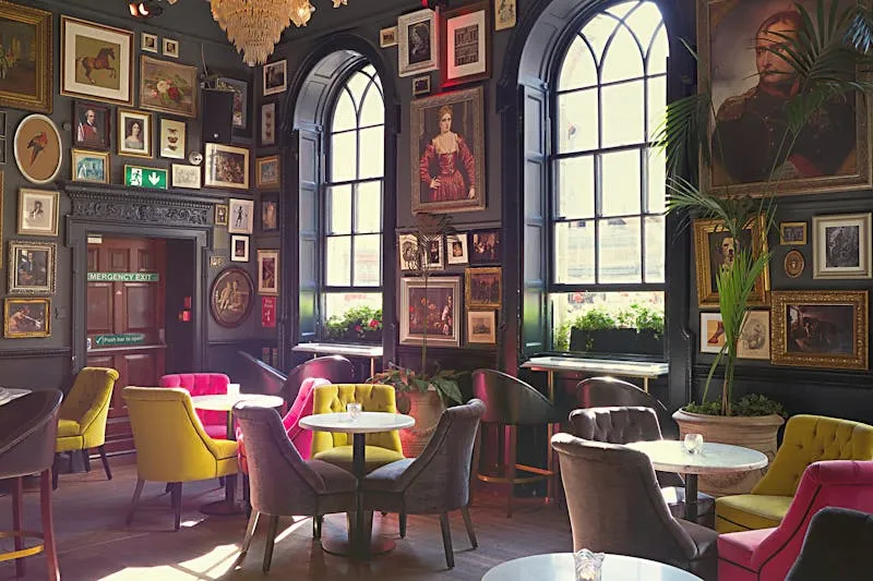
2. The organic composition (salon style)
The most "Pinterest" layout: frames of different sizes and formats, assembled freely but cohesively around an invisible centre. It's the most dynamic, the most personal — and the riskiest if you don't prepare with paper templates first.
Basic rule: start with the largest frame (which becomes the focal point), place it slightly off-centre, then build around it. Alternate large and small formats. Keep spacing of 5–8cm between frames, even if it doesn't need to be perfectly uniform.
Number of frames: minimum 5 for it to read as a composition, not a few random things stuck up. Maximum: as many as you like, as long as the whole thing breathes.
3. The horizontal line (frieze)
All frames aligned on a single row at the same height. Clean, modern, perfect for a hallway or above a sideboard. The frieze works with identical frames (gallery effect) or varied sizes aligned by centre (midline at the same height).
Ideal height: the centre of the frames at 145–150cm from the floor — eye level, no more, no less. It's the standard in museums and art galleries worldwide, and for good reason: it's the most comfortable viewing height.
4. The vertical column
Three to five frames stacked vertically. Perfect for a narrow space — between two doors, beside a window, in an alcove. The column visually elongates the room and creates the impression of a higher ceiling. Matching frames for a "totem" effect, or decreasing sizes from bottom to top for a graphic look.
5. The salon-style hang
Frames hung above and alongside each other, aligned by the top edge — like the painting salons of 18th-century Paris. Majestic, slightly maximalist, perfect for a large wall with plenty of space. You see this layout in Haussmann-era Parisian flats and in stately homes, and it looks magnificent when done well.
Tip: align all frames along the top edge and let them fall naturally downwards. Largest at the top, smallest at the bottom. The effect is spectacular.
Choosing frames: materials, colours and sizes
The frame matters as much as what's inside — if not more. It's what creates the visual unity of your gallery wall.
The common-thread rule: you need at minimum ONE shared element across all your frames. Either colour (all black, all white, all gold), or material (all natural wood), or format (all 30×40cm). If you mix everything — black, gold, wood, plastic, round, square, small, large — with zero common thread, the result will be chaotic rather than "eclectic chic."
Black frames: the safest choice. They work with everything, give structure to the composition and make the content pop. On a white wall, guaranteed contrast. On a coloured wall, they frame without weighing things down.
Natural wood frames: warm, Scandi, perfect for a cosy vibe. Watch the shade: light oak is versatile, dark walnut is more statement. Avoid mixing too many different wood tones — two max.
White frames: discreet, they almost disappear on a white wall — putting all the focus on the content. Perfect for a clean art-gallery feel. On a dark wall, striking "window" effect.
Gold or brass frames: chic, slightly Art Deco. Spectacular on a dark green or navy wall. Use sparingly if mixing with other finishes — gold draws the eye and can throw off the balance.
The mix that works: 70% of a base frame (e.g. black), 30% of an accent frame (e.g. natural wood). Same logic as the 60-30-10 rule in decor: a dominant, a complement, an accent. Cohesive but not monotonous.
Where to buy frames
Budget: IKEA (RIBBA and HOVSTA ranges: from £3, decent quality), Dunelm, B&M, Wilko, The Range. Functional and affordable.
Mid-range: John Lewis, Habitat, Oliver Bonas. Frames between £10 and £30, good quality, wide choice of sizes and finishes.
High-end: custom framing from a professional framer (expect £30–120 per frame depending on size and mount), Desenio, The Poster Club, Paper Collective (designer frames in aluminium or solid wood).
What to frame: photos, prints, objects and mixes
The big question. And the answer is: almost anything, as long as it respects your common thread.
Your own photos: the most personal choice. Print them in a matte finish (more modern than gloss) from an online lab (Photobox, CEWE, Boots Photo) or your local print shop. 8×10 inches is the most versatile standard format. Consider black-and-white photos — they integrate into any decor style.
Posters and prints: Etsy, Desenio, Posterstore, Society6 are bursting with illustrations, typography and art photography at every price point (from £4). Watch out: choose a minimum paper weight (170gsm) so the poster doesn't buckle in the frame.
Postcards and tickets: in a frame with a large white mount, a holiday postcard or an old gig ticket takes on a whole new dimension. It's the "visual diary" gallery wall — ultra personal.
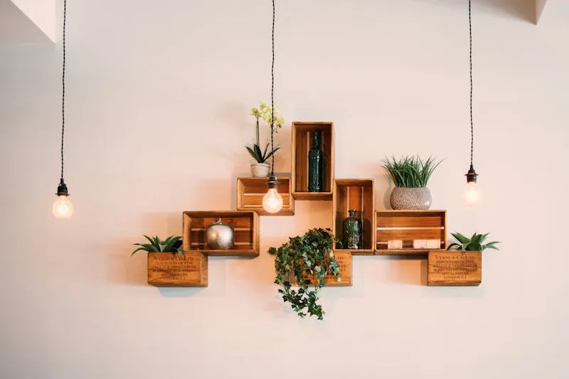
Objects: a small round mirror, a wooden letter, a macramé piece, a tiny shelf with a plant — mixing frames with 3D objects creates a more dynamic composition than a simple line of frames. It's THE current gallery wall trend.
Warning: Maintain a colour-palette consistency in what you frame. If your photos and illustrations are in tones of blue, black/white and beige, don't add a neon-red poster in the middle — it'll grab all the attention and throw off the balance. Stick to 2–3 dominant colours max in the content.
Spacing and proportions: the science of looking good
Spacing is what separates a "Pinterest gallery wall" from "frames hung randomly by someone in a hurry." It's invisible when done well — and glaringly obvious when botched.
Standard spacing: 5–8cm between each frame. This range works in 95% of cases. Less than 5cm and the frames visually overlap, making the composition feel cramped. More than 10cm and the frames drift apart, no longer reading as a cohesive group.
Grid spacing: 5–6cm, rigorously identical throughout. Not "roughly" — exactly identical. It's a grid; symmetry is everything.
Organic composition spacing: 6–8cm on average, with slight variations acceptable. What matters is that the spacing looks visually consistent — not necessarily measured to the millimetre.
Gallery wall height: the centre of the whole composition (not the centre of the middle frame, but the centre of the entire group) should sit at roughly 145–150cm from the floor. That's standard eye height — the one used in museums and art galleries worldwide.
The two-thirds rule: If your gallery wall sits above furniture, it should cover roughly two-thirds of the furniture's width. Above a 200cm sofa, the gallery wall should be about 130–150cm wide. Above a 120cm sideboard, about 80–90cm. This proportion creates a natural visual balance.
The paper template method: zero unnecessary holes
This is THE technique that changes everything. Instead of hammering nails at random and hoping things end up straight (spoiler: they never do on the first try), you plan everything with paper and tape before making a single hole.
Step 1: Cut the templates
Take some brown paper, newspaper or even opened paper bags. Cut a rectangle for each frame — exactly the frame's dimensions. Write the name/content of each frame on its template so you don't get muddled.
Step 2: Compose on the floor
Lay your templates on the floor in the final configuration. Play with positions, spacing, combinations. Take a photo from above. Adjust. Take another photo. Compare. It's free, unlimited, and so much easier to visualise on the floor than up in the air.
Step 3: Transfer to the wall
Once you're happy with your floor layout, tape the templates to the wall with masking tape (the blue painter's tape that doesn't leave marks). Place each template exactly where its frame will go. Step back, look, adjust if needed.
Step 4: Mark the holes
For each template, measure and mark the exact position of the hook/nail — by transferring the position of the hanging wire or bracket from the back of the frame. A small pen mark through the paper, directly onto the wall. When you remove the templates, you'll have perfectly positioned marks.
Step 5: Hang
Remove the templates, hammer your nails on the marks. Hang the frames. Check they're level with a spirit level (or your iPhone's level app). Admire. You're a pro.
Masking tape warning: Standard painter's tape is designed to be removed within 48 hours. Beyond that, it can leave adhesive residue — especially on matt paints or wallpaper. Don't leave templates taped to the wall for weeks "while you decide."
Hanging: techniques and fixings by wall type
The best gallery wall plan in the world is useless if your frames crash down at 3am. Here are the fixings for every situation.
Plasterboard / drywall (most modern flats): for light frames (up to 2kg), simple steel picture nails suffice. For medium frames (2–5kg), use X-hooks with 3 nails — extremely solid. For heavy frames (over 5kg), plasterboard anchors or toggle bolts are essential.
Brick / concrete walls: drill + rawlplug + screw. No getting around it. The good news: it'll hold even a 10kg mirror. The bad news: you need a hammer drill and a bit of courage.
No-drill options (renters / no drill): Command strips (3M) hold surprisingly well for light frames (up to 3–4kg depending on the model). They remove cleanly without damaging the wall — perfect for rented flats. Another option: adhesive picture rails (a rail you stick on, frames hang from wires).
Renter's tip: If your landlord bans holes, Command picture-hanging strips are your best friends. Get the "for pictures" model (not the standard strips), respect the max weight, and follow the application instructions to the letter (clean surface, 30-second press, one-hour wait before hanging). They genuinely hold.
The 8 mistakes that ruin a gallery wall
I've committed several of these myself. Learn from my mistakes (and those of everyone whose fails I've studied on Reddit).
Mistake #1: Hanging too high. The most common error, by a mile. The centre of your composition should be at eye level (145–150cm from the floor), not up near the ceiling. If you have to crane your neck to look at your frames, they're too high.
Mistake #2: Too small for the wall. Four little 5×7 frames lost on a 3-metre-wide wall doesn't read as "minimalist" — it reads as "I forgot the rest." The gallery wall should occupy at least two-thirds of the available wall space above the furniture.
Mistake #3: Hanging straight away without templates. "It'll be fine, I've got a good eye." No. Nobody's eye is that good. The paper template method takes 20 minutes and saves you hours of repositioning and a wall peppered with unnecessary holes.
Mistake #4: Zero common thread. Mixing black, gold, white, wooden, round, square and rectangular frames with no unifying logic. Choose at minimum ONE unifying element (frame colour or content palette).
Mistake #5: All frames the same size. Fine for a grid, but in an organic composition it lacks dynamism. Mix at least 3 different sizes to create visual rhythm.
Mistake #6: Content all over the place. A portrait, a seascape, a motivational quote, a child's drawing, a festival photo and a film poster. Each frame pulls in a different direction and the whole thing never gels.
Mistake #7: Neglecting lighting. A gallery wall in dim light loses all its impact. If natural light is insufficient, add directed lighting — picture lights, track spots, or even discreet LED strips.
Mistake #8: "I'll finish it later." Starting a gallery wall with 4 frames intending to complete it later. Result: 4 lonely frames for two years because you can't find matching frames any more. Buy all your frames in one go, even if it takes you a while to fill the last few.
Budget: from bargain to high-end
Because a gallery wall can cost £25 as easily as £600, here are three concrete budget plans.
Budget plan (£25–£60)
Frames from IKEA RIBBA (from £3), Dunelm, B&M or The Range. Content: your own photos printed online (5–40p per print), posters printed at home or downloaded from free sites (Unsplash, Rawpixel). 6–8 frames, organic composition. Hanging: simple nails or Command strips.
Mid-range plan (£80–£200)
Frames from John Lewis, Habitat or Oliver Bonas (£10–25 each). Content: mix of your photos in matte prints + 2–3 prints from Desenio, Posterstore or Etsy (£6–18 each). A small round mirror as an accent (~£12–20). 8–12 frames, grid or organic layout. Hanging: X-hooks.
High-end plan (£250–£600)
Custom framing from a professional framer (£30–100 per frame) or designer frames (Moebe, Paper Collective). Content: signed art prints, exhibition posters, family photos printed at a fine-art lab. 10–15 frames, salon-style or column composition. Dedicated directed lighting.
The tip that makes all the difference: The mount. A white mount around your photo or print (the white space between the image and the frame) makes any £4 print look like a gallery-framed piece. Instant "professional" effect, for the price of a cut piece of card. IKEA sells frames with mounts included (RIBBA and HOVSTA ranges).
Gallery wall FAQ
How many frames do I need for a gallery wall?
Minimum 5 for it to genuinely read as a "gallery wall" rather than a few isolated frames. No maximum — salon-style compositions can go up to 20–30 frames on a large wall. For a first attempt, 7–9 frames is a solid middle ground: enough for a rich composition, not so many it becomes unmanageable.
Can I mix black frames with wooden frames?
Yes, it's actually a very successful combination if you respect a ratio. About 70% one dominant colour, 30% the other. Black + light oak is a classic that works in almost any interior. Avoid mixing more than two different frame types though — beyond that, visual coherence breaks down.
Do Command strips actually hold?
Yes, if you follow the instructions to the letter: clean, degreased surface, firm 30-second press, one-hour wait before hanging the frame, and respecting the maximum weight on the packaging. They hold for years without budging. The only catch: walls with flaking paint or wallpaper — the strip holds, but it can pull off the paint layer underneath.
How do I align a grid perfectly without a laser level?
The spirit level app on your smartphone (free, pre-installed on iPhone) is perfectly adequate for home use. For spacing, cut a cardboard template to the exact width of your desired gap (say, 6cm) and use it as a spacer between each frame. Free and devastatingly effective.
Can I hang a gallery wall in a rented flat?
Yes. Command strips leave no trace if removed correctly (pull slowly downward, don't rip). For heavier frames, small nail holes fill easily with a tube of white filler (~£3 from any DIY shop). Your landlord won't notice a thing.
What's the best layout for a beginner?
The grid. Identical frames (same size, same colour), aligned in rows and columns with fixed spacing. It's the easiest to get right, the most forgiving of small inaccuracies, and it always looks polished. A 3×3 grid of black 8×10 frames with 6cm spacing: there's your first gallery wall, and it will look great.
At what height should I hang a gallery wall?
The centre of the entire composition (not the centre of a single frame) should be at 145–150cm from the floor — eye level. If the gallery wall sits above furniture, leave 15–20cm between the top of the furniture and the bottom of the lowest frame. Above a sofa, 20–25cm above the backrest.